Wedding Outfit Color Checker
Current Selection
Imagine this: you’ve spent weeks picking the perfect outfit for a friend’s big day. You feel confident, stylish, and ready to dance. Then, during the reception, your phone buzzes. It’s a text from the bride’s mom. “Please take that off,” it reads. Your heart sinks. The color you chose isn’t just a fashion misstep; it’s a photo disaster waiting to happen.
As someone who has spent years behind the lens capturing these moments in Auckland and beyond, I see the same mistakes over and over. Guests often think about comfort or trendiness first, but they forget that their clothes are part of a larger visual story. In wedding photography, which is the art of documenting a couple's marriage ceremony and celebration through images, every element matters. Your outfit interacts with light, background, and most importantly, the couple themselves.
The Absolute No-Go: White and Its Cousins
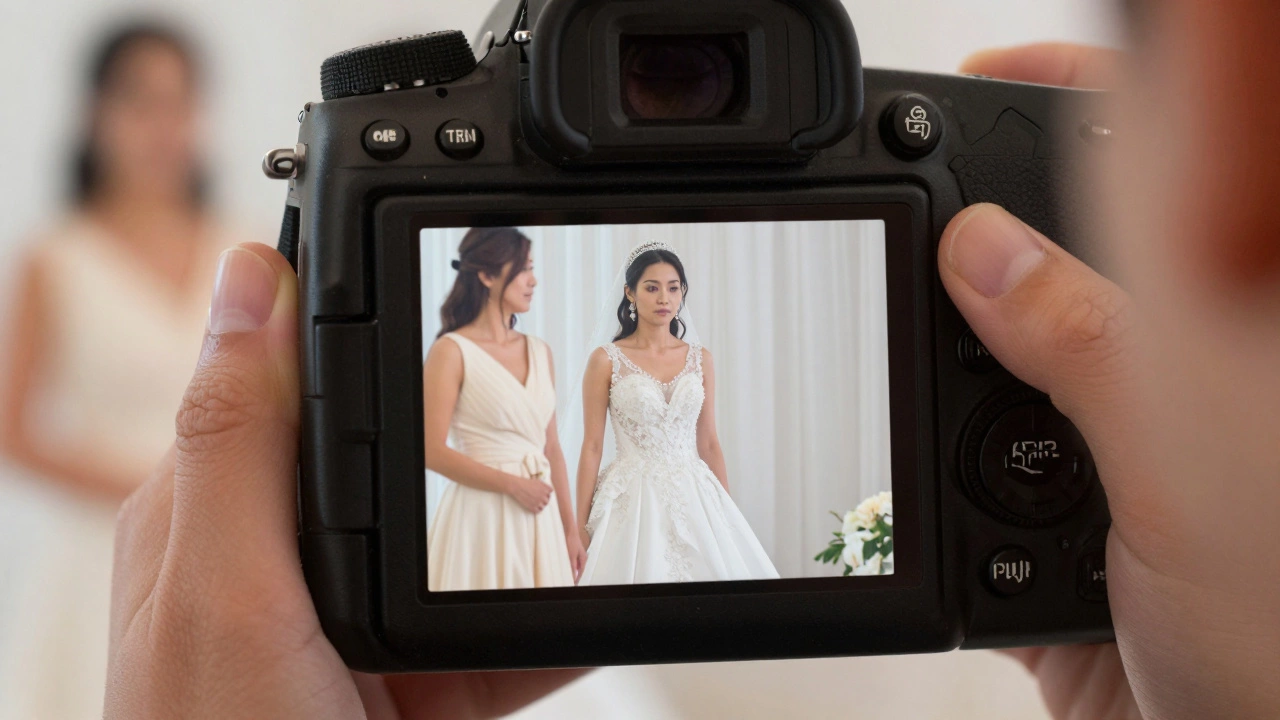
Let’s start with the most obvious rule, though people still break it constantly. Never wear white. But what does "white" actually mean in this context? It’s not just pure, bridal white. If you’re wearing an ivory, cream, champagne, or even a very pale beige dress, you are risking a major faux pas.
Why is this such a big deal? Think about how cameras work. When a photographer sets up for a portrait of the bride, they adjust the exposure to make her skin glow and her dress look crisp. If you stand next to her in a similar shade, the camera struggles to distinguish between you two. The result? You might end up looking like a ghostly duplicate of the bride in the group shots. It’s distracting and disrespectful to the person whose day it is.
- Pure White: Obvious no. Save it for your own wedding.
- Ivory/Ecru: Too close to traditional bridal shades.
- Champagne/Golden Beige: Often used in luxury wedding gowns. Avoid unless explicitly told otherwise.
- Pale Cream: Can reflect too much light in outdoor settings, washing out other guests.
If you love light neutrals, opt for soft pastels like lavender, mint green, or powder blue. These colors photograph beautifully without competing with the bride’s gown.
Black: The Great Debate
For decades, black was strictly forbidden at weddings, reserved only for funerals. Times have changed, especially in urban centers like Auckland. Today, a sleek black cocktail dress or a sharp black suit is often acceptable, particularly for evening or winter weddings. However, there are nuances you need to understand to keep your photos looking good.
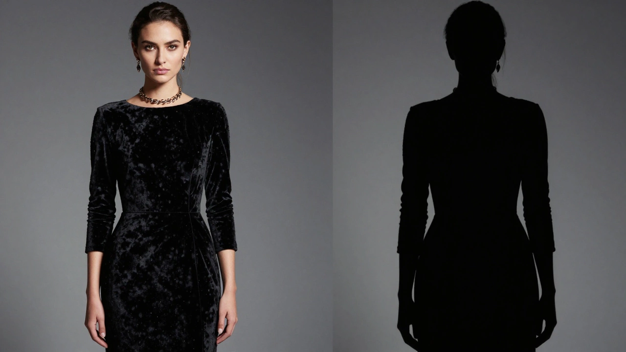
In photography, black absorbs light. This can be problematic if the lighting is poor. If you’re attending a dimly lit church ceremony or a candlelit dinner, a large area of black fabric can become a "light hole." The camera sensor tries to compensate by brightening the image, which can lead to grainy photos or washed-out faces around you. Conversely, in bright sunlight, black can create harsh shadows on your face.
To wear black successfully, ensure the fabric has some texture (like velvet or lace) to catch the light, or accessorize with metallic jewelry to add visual interest. Also, consider the formality. For a casual beach wedding, all-black might look too somber. For a formal ballroom event, it’s chic and safe.
| Color | Daytime Garden | Evening Formal | Beach/Casual | Photography Note |
|---|---|---|---|---|
| White/Ivory | Avoid | Avoid | Avoid | Confuses exposure settings |
| Black | Cautious | Excellent | Avoid | Absorbs light; needs texture |
| Bright Red | Good | Good | Okay | Can cause red-eye or cast tones |
| Neon Pink | Avoid | Avoid | Avoid | Overwhelms the frame |
Bright Reds and Neon Shades
You might hear that red is a power color, perfect for making a statement. While deep burgundy or wine reds are usually fine, bright fire-engine red can be tricky in photos. Why? Because digital sensors sometimes struggle with intense reds. They can "bleed" into surrounding areas, creating a halo effect or casting a reddish tint on nearby faces. This is called chromatic aberration, and it looks unprofessional in final prints.
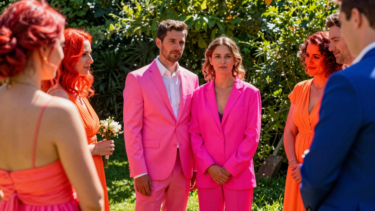
Neon colors-think electric pink, lime green, or bright orange-are even worse. They dominate the visual field. In a group shot, your neon shirt will pull the viewer’s eye away from the couple. You become the focal point, which defeats the purpose of being a guest. Stick to jewel tones like emerald, sapphire, or ruby. They’re rich, vibrant, and photograph beautifully without stealing the show.
Camouflage and Military Patterns
This one seems random, but it’s a real issue in many places, including New Zealand. Wearing camouflage patterns (camo) to a wedding can be seen as insensitive, especially if the couple has military connections or if the wedding is held near Veterans Day or Anzac Day. Beyond the social taboo, camo patterns can create moiré effects in photos. Moiré is a wavy, rippling distortion that happens when a camera captures repetitive patterns like tight stripes or camo. It looks glitchy and is hard to fix in post-processing.
Overly Casual Prints and Logos
While not a "color" per se, certain patterns act like bad colors in photos. Large, busy logos, band t-shirts, or overly casual floral prints that clash with the wedding theme can ruin a photo’s composition. Imagine a bride in a delicate lace gown standing next to a guest in a loud Hawaiian shirt. The contrast is jarring. Keep patterns subtle and elegant. Small polka dots, subtle florals, or geometric designs work well because they add texture without distraction.
How to Choose the Right Color: A Photographer’s Checklist
Before you buy that dress or suit, run through this quick mental checklist. It will save you from awkward texts and blurry photos.
- Check the Invitation: Does it specify a dress code? "Black Tie" means dark, formal colors. "Beach Casual" allows for lighter, brighter hues.
- Consider the Season: Spring and summer weddings call for lighter palettes (pastels, soft blues). Fall and winter invite deeper tones (navy, plum, forest green).
- Think About the Venue: Outdoor weddings in green gardens? Avoid green outfits that might blend in too much. Indoor ballrooms? Jewel tones pop against dark backgrounds.
- Ask the Couple: If you’re unsure, a quick text asking, "I’m thinking of wearing [color], does that fit your vision?" shows respect and prevents errors.
Remember, the goal is to complement the couple, not compete with them. Your outfit should enhance the beauty of the day, not detract from it. By avoiding these common pitfalls, you’ll look great in person and shine in every photo.
Can I wear white to a wedding if I'm not the bride?
No, you should never wear white, ivory, or champagne to a wedding unless the couple explicitly asks guests to do so. These colors are traditionally reserved for the bride and can confuse photographers and distract from her in photos.
Is it okay to wear black to a daytime wedding?
It depends on the formality. For a casual daytime garden wedding, black might look too heavy. For a formal afternoon event, a black suit or dress is acceptable. Just ensure the fabric has some texture to catch the light and avoid looking flat in photos.
Why are neon colors bad for wedding photos?
Neon colors are extremely bright and can overwhelm the camera sensor, causing color bleeding or drawing attention away from the couple. They can also cast unwanted colored reflections on nearby faces, ruining the natural look of portraits.
What colors look best in outdoor wedding photos?
Soft pastels like lavender, mint, and blush pink photograph beautifully outdoors. They complement natural light and greenery without clashing. Jewel tones like emerald and sapphire also work well, providing rich contrast against sky and foliage.
Should I avoid patterned clothing at weddings?
You don't need to avoid patterns entirely, but steer clear of large, busy logos or tight repetitive designs like camouflage. These can cause moiré effects (wavy distortions) in photos. Subtle patterns like small florals or polka dots are generally safe and add nice texture.