You’re not hunting for a single "right" color. You’re deciding on a palette that flatters your outfits, fits your venue and season, photographs well, and stays within budget. I’ve coached a lot of couples through this and the most common regret is picking shades that look great on Pinterest but clash in real light or with the dress. Here’s the clear, easy way to get it right.
- Use a 60-30-10 rule: one dominant color, one supporting color, one accent; add a neutral so everything breathes.
- Match undertones to your dress, suits, and venue (warm vs cool). Ivory loves warm blush and toffee; bright white loves crisp greens and blue-based pinks.
- Season and availability matter for price and freshness-choose in-season blooms or smart swaps.
- Test colors in your actual lighting; some reds, purples, and whites shift on camera.
- When in doubt, go tonal (layers of one color family) for a timeless, cohesive look.
Start With Your Palette: A Quick Answer
Pick a tight palette that serves your setting and story. Aim for three to five shades total: a base neutral (ivory, champagne, stone, or soft gray), one dominant hue, one supporting hue, and a tiny pop if you want drama. Keep greenery as a color choice too-blue-green eucalyptus feels cool; olive and ruscus feel warm.
Your flowers should echo your bigger palette: outfits, linens, stationery, and venue finishes. Black-tie ballroom? Think crisp whites/ivories, gentle blush, and sculptural greenery with metallic touches. Farm or garden venue? Softer, airy tones and natural textures read better than neon brights.
Undertones are everything. A bright-white gown (cool) can make warm cream flowers look yellow. Ivory gowns (warm) can make icy white flowers look stark. Hold petals next to fabric in daylight to spot clashes fast.
Cultural meaning matters too. Red is lucky and celebratory in many Asian cultures; white is associated with mourning in some contexts. If symbolism is part of your day, choose your hero color first and build around it with softer complements so the meaning shines without overwhelming the room.
If you just need the simplest rule: choose a palette that complements your outfits, your venue’s dominant color, and the season; limit to three core shades plus a neutral; and check it in the actual light of your ceremony and reception spaces.
Step-by-Step: How to Choose Your Wedding Flower Colors
-
Define your vibe in one sentence. “Classic and elegant,” “modern minimal,” “wild garden,” or “bold and festive.” That single line cuts choices in half.
-
Audit the immovable stuff. Note your venue’s dominant colors (dark wood, white walls, brick, greenery), your dress shade (bright white, silk white, ivory, champagne), suit/tux colors, and linen colors. Mark undertones: warm (creamy, golden, terracotta, olive) vs cool (icy white, silver, navy, slate).
-
Choose your neutral base. Ivory, cream, stone, soft gray, or sand. This is the canvas that prevents a busy look.
-
Pick a dominant color. Choose one hue that aligns with your vibe and season. Spring likes pastels (blush, lilac, butter yellow). Summer handles brights (coral, fuchsia). Fall loves earth tones (terracotta, rust). Winter wears jewel tones (burgundy, plum).
-
Add a supporting color and an optional pop. Supporting colors are adjacent or softened versions of your dominant (rose + mauve). A pop is a small amount of contrast (navy ribbon, deep fig scabiosa) used sparingly to add depth.
-
Pick your greenery tone. Blue-green eucalyptus (cool) vs yellow-green ruscus/olive (warm). This tweak alone can fix an undertone mismatch.
-
Check season and swaps. Peonies are late spring; dahlias are late summer-fall; garden roses are more flexible; ranunculus is cooler months; anemones prefer cool temps; tulips are spring. If a flower is out of season, ask for lookalikes: ranunculus for peonies, caramel or toffee roses for warm neutrals, lisianthus for delicate ruffles, chrysanthemums for structure on a budget.
-
Test in your real light. Bring fabric swatches to your venue at the time of day you’ll be there. Hold cheap grocery blooms in similar shades against your dress fabric and linen sample. Warm evening bulbs can push whites yellow; cool LEDs can make cream look flat. Reds can photograph very dense; blue-purples can shift toward magenta.
-
Sanity-check with your photographer. Ask what colors shine in your venue. Many photographers prefer mid-tones over neons; very dark reds can “clip” (lose detail). Skin tones tend to look great next to soft neutrals, warm blush, and natural greens.
-
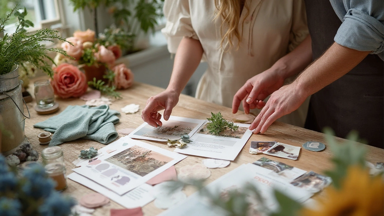
Share a clear palette brief with your florist. Include 3-5 color swatches, 5-7 inspiration images, what to avoid, and your budget range. Request one sample item (a bouquet or centerpiece) 4-6 weeks out to confirm shades and adjust.
Helpful ratios: 60-30-10 is a safe starting point. For minimal looks, go 80-20 (one hue plus a neutral). For moody or bold looks, keep the accent powerful but small (5-10%).
Common pitfalls to skip:
- Pure white blooms with an ivory gown can read yellow on camera. Mix white and cream, or lean into ivory with cool greenery.
- Staining: remove lily pollen; deep red roses and peonies can stain fabrics; test before pinning boutonnieres.
- Temperature: light pastels can look washed out under strong sun; jewel tones can disappear in dark rooms without candlelight or uplighting.
- Fragility: anemones and ranunculus bruise easily; hydrangeas wilt fast in heat; consider sturdier alternates for bouquets tossed or worn all day.
- Dyed blooms can bleed when wet; sealed or naturally colored options are safer for white gowns and linens.
Real Palettes That Work (By Season, Mood, and Venue)
Here are tested palettes that photograph beautifully and play well with real venues and seasons.
-
Classic black-tie (ballroom or museum): Bright white + ivory + soft blush + deep green. Flowers: garden roses, peonies (spring), ranunculus, phalaenopsis orchids, smilax or camellia foliage. Add gold or black accents in candles and ribbons.
-
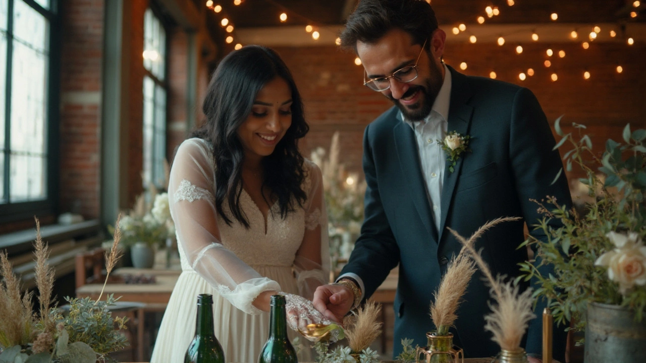
Modern minimal (loft, gallery): Crisp white + toffee + smoke (taupe/stone). Flowers: toffee and quicksand roses, white ranunculus, lisianthus, bleached ruscus. Use matte black or stone vessels; one sculptural flower per bud vase for tables.
-
Garden party (vineyard, backyard): Petal pink + butter yellow + lilac + sage. Flowers: sweet pea, garden roses, butterfly ranunculus, delphinium, herbs (mint). Soft, airy greenery and natural linen runners.
-
Coastal (beach, lakehouse): Soft white + sand + sea-glass blue + gray-green. Flowers: white roses, delphinium, nigella, white stock, silver dollar eucalyptus. Keep it breezy; avoid heavy burgundies in harsh midday sun.
-
Desert neutral (barn, adobe): Terracotta + rust + nude + ivory. Flowers: toffee/quicksand roses, caramel carnations, cappuccino ranunculus, bunny tail grass, olive foliage. Great with wood tables and amber glass.
-
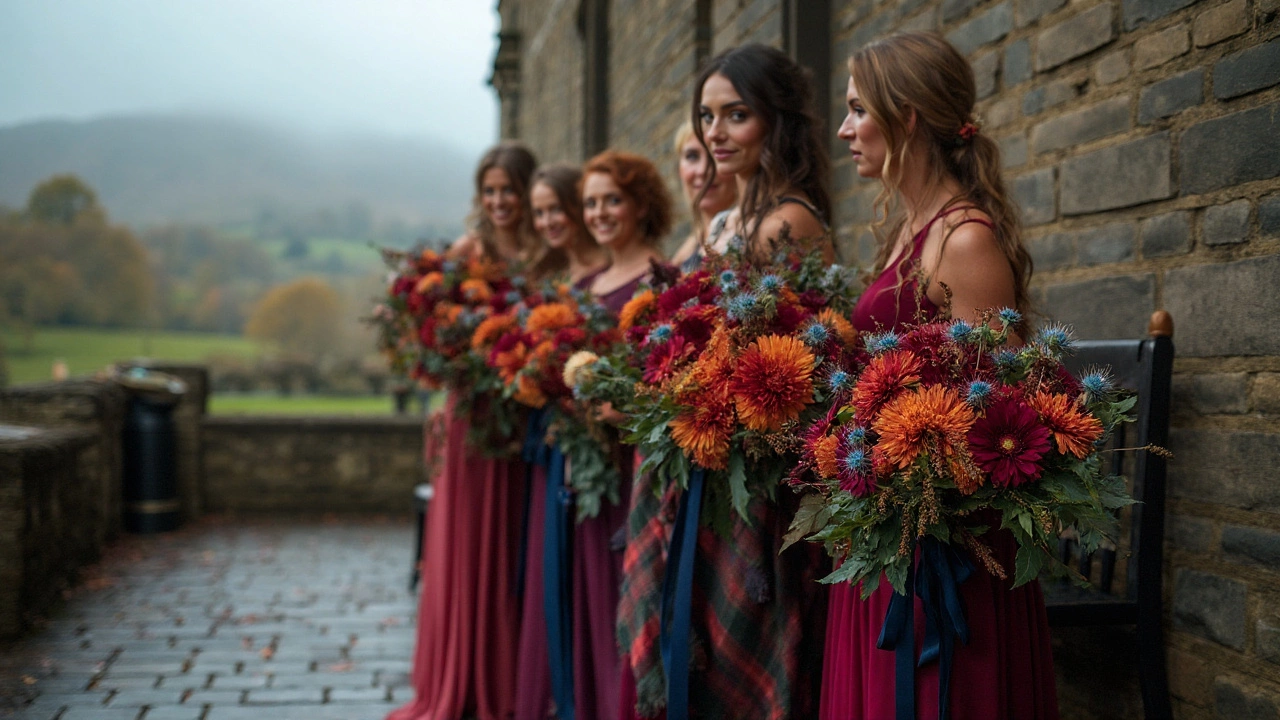
Jewel-tone winter (library, industrial): Burgundy + plum + fig + forest green + candlelight. Flowers: anemones, amaranthus, scabiosa, ranunculus, garden roses, winter greenery. Add brass or antique gold.
-
Bold celebration (South Asian, fusion): Fuchsia + saffron + marigold + emerald. Flowers: marigolds, roses, bougainvillea (or a lookalike), ranunculus, cymbidium orchids. High energy, great on camera; ground with plenty of green.
-
Monochrome moment: All tones of one color (all pinks or all whites). Mix textures and sizes so it doesn’t feel flat-roses + hydrangea + stock + sweet pea + orchids.
| Color family | Mood it creates | Best season | Pairs well with | Flower examples | Budget notes |
|---|---|---|---|---|---|
| Whites & Ivories | Timeless, clean, formal | All | Metallics, deep green, black | Roses, orchids, hydrangea, stock | Can be luxe; mix affordable fillers to save |
| Pastels (blush, lilac, butter) | Romantic, soft, airy | Spring-early summer | Sage, stone, light wood | Peonies (spring), ranunculus, sweet pea | Peonies are pricey; use garden roses as swaps |
| Neutrals/Earthy (toffee, taupe, terracotta) | Modern, warm, editorial | All, esp. fall | Ivory, rust, black accents | Toffee/quicksand roses, carnations, grasses | Flexible pricing; great with textural fillers |
| Bright/Jewel (fuchsia, saffron, emerald) | Festive, high-energy | Summer-winter indoors | Gold, deep green | Roses, ranunculus, orchids, marigolds | Concentrate brights; fill with greenery to balance cost |
| Moody/Dark (burgundy, plum, navy) | Dramatic, intimate | Fall-winter | Ivory, candlelight, brass | Dahlias, scabiosa, anemones, amaranthus | Dark hues need lighting; budget for candles/uplights |
| Blue & Slate | Calm, coastal, cool | Spring-summer | White, sand, gray-green | Delphinium, nigella, thistle, tweedia | Some blues are seasonal; mix with whites to stretch |
One more truth: the vase, ribbon, and candle color finish your palette. Black or brass vessels deepen moody looks; clear glass and white ceramics keep things light; silk ribbons in taupe or blush can pull everything together fast.
Cheat Sheets: Formulas, Pairings, and Pitfalls
Palette formulas that almost never miss:
- Monochromatic: One color, many tones (rose → blush, rose, mauve). Rich texture stops it from feeling flat.
- Analogous: Neighbors on the color wheel (peach, coral, pink). Soft, romantic, easy to blend.
- Complementary: Opposites (blue + orange; purple + yellow). Use one as the hero and the other as a small accent.
- Neutral + Pop: Ivory + taupe + a small pop (fig, navy, fuchsia). Great for modern spaces.
Undertone quick guide:
- Warm base (ivory dress, wood venue): terracotta, peach, toffee, olive, cream.
- Cool base (white dress, gray/black/stone venue): crisp white, blush with blue undertone, mauve, slate, eucalyptus.
- Mixed base: go neutral-heavy (ivory/stone) and use greenery tone to tilt warm or cool.
Flower swaps to protect the palette and budget:
- Peony → garden rose (similar ruffle, wider season)
- Dahlia → chrysanthemum or zinnia (shape and color depth)
- Ranunculus → spray roses or lisianthus (delicate, layered)
- Anemone → cosmos (in season) or scabiosa (center detail)
- Blue delphinium → nigella or tweedia (soft blue, airy)
Decision helpers:
- Dark wood venue? Brighten with ivory and lighter greens; avoid all-jewel tones without extra candlelight.
- All-white loft? Add one warm neutral (toffee, champagne) so photos don’t feel sterile.
- Green vineyard? Don’t drown in green-on-green-use white/ivory and a defined accent (mauve, navy ribbon).
- Midday beach sun? Pastels can look washed out; include a mid-tone (sand, taupe, deeper pink) for contrast.
- Red or purple lovers? Keep loads of texture and add a lighter companion (ivory, blush) so detail reads on camera.
Checklist to give your florist:
- 3-5 color swatches with undertone notes (warm/cool)
- Venue photos and lighting time (ceremony and reception)
- Dress fabric swatch or shade name; suit/tux color
- Must-have and must-avoid blooms/colors
- Budget range and priorities (bouquets vs installations)
- Any cultural or symbolic color requirements
Things that trip people up:
- White roses can pull green under harsh LEDs; add warmer candlelight or mix with cream.
- Lily pollen stains-ask for stamens removed on open lilies.
- Dyed baby’s breath or palms can rub off when damp; seal or swap to natural tones.
- Very dark napkins + very dark flowers = a black hole in photos. Break it up with lighter plates or runners.
Mini‑FAQ and Next Steps
Are white flowers boring? Not if you layer texture and tone: mix white, cream, and a hint of toffee or soft gray; vary petal size (stock, roses, orchids) and add structured greens. Candlelight adds depth fast.
Can I mix pastels and brights? Yes-anchor with a neutral and let only one bright lead. Example: blush + ivory base with tiny pops of fuchsia bougainvillea. Keep the pop under 10%.
How many colors is too many? More than five gets messy. Use three core hues plus a neutral; if you want “lots of color,” do monochrome clusters (all corals in one cluster, all lilacs in another) across the space.
Do colors change the price? Color doesn’t; specific flowers do. In-season, sturdy blooms cost less and last longer. Ask for swaps that keep your shade but lower the stem price.
What about meaning? Red = love/luck in many Asian cultures; white can signal mourning in some contexts; marigolds are festive in South Asian and Latin traditions. If meaning matters, lead with that color and balance the rest of the palette around it.
Are dyed flowers okay? They can be striking in editorial designs, but some bleed on wet contact and can stain fabrics. If your outfits or linens are light, use natural tones or ask your florist to seal dyed pieces.
How do I make colors pop in photos? Contrast and light. Pair mid-tone blooms with light linens, or light blooms with darker runners. Add candlelight or soft uplighting to help detail read, especially with moody palettes.
How early should I lock in colors? Set your palette 6-9 months out so rentals and stationery align. Confirm final shades with your florist 6 weeks out; approve one sample piece so you can adjust undertones if needed.
What if the rental company runs out of my linen color? Keep a backup neutral (stone or ivory) on your order. You can swing the vibe back with ribbon color, candles, and accent blooms.
Any legit data behind these choices? Real wedding reports from major industry sources consistently show couples choose a defined color palette and coordinate across flowers, attire, and decor. Photographers also note that mid-tones and mixed neutrals hold detail better than extreme neons or very dark-only palettes under typical wedding lighting.
Next steps for you:
- Create a 1-page palette: neutral + dominant + support + optional pop. Add your greenery tone.
- Gather 5-7 inspo images that match your undertone and vibe. Avoid mixed lighting images that confuse expectations.
- Visit your venue with fabric swatches at the time you’ll be there. Snap phone photos to see how colors behave.
- Share the palette with your florist and photographer. Ask for a single sample bouquet/centerpiece 4-6 weeks out.
- Confirm ribbon, vessel, and candle colors; they lock the palette together.
Troubleshooting by scenario:
- My white dress makes cream flowers look yellow. Add crisp white blooms and cooler greenery (eucalyptus), and swap warm candle bulbs for clearer light.
- The venue is dark and my jewel tones vanish. Increase ivory/cream ratio, add brass or gold vessels, and budget for more candlelight.
- Budget cut just hit. Keep the palette but switch to fewer hero blooms and more textural fillers (stock, carnations, chrysanthemums, greenery). Use color in ribbons and candles.
- Weather turned hot. Swap fragile blooms for sturdier options in the same shade, keep arrangements hydrated, and schedule late-day delivery.
- Last-minute linen change. If linens went lighter, deepen your accent color slightly. If linens went darker, increase your ivory/white ratio.
If you keep one thing from all this, make it the palette brief. When your florist, planner, and photographer are aligned on the same few shades and undertones, every detail-from bouquets to boutonnieres to table candles-clicks into place. That’s the secret behind flowers that look expensive and cohesive, no matter your budget or venue. And yes, your wedding flowers color is less about a single hue and more about how your few chosen shades play with light, fabric, and space.