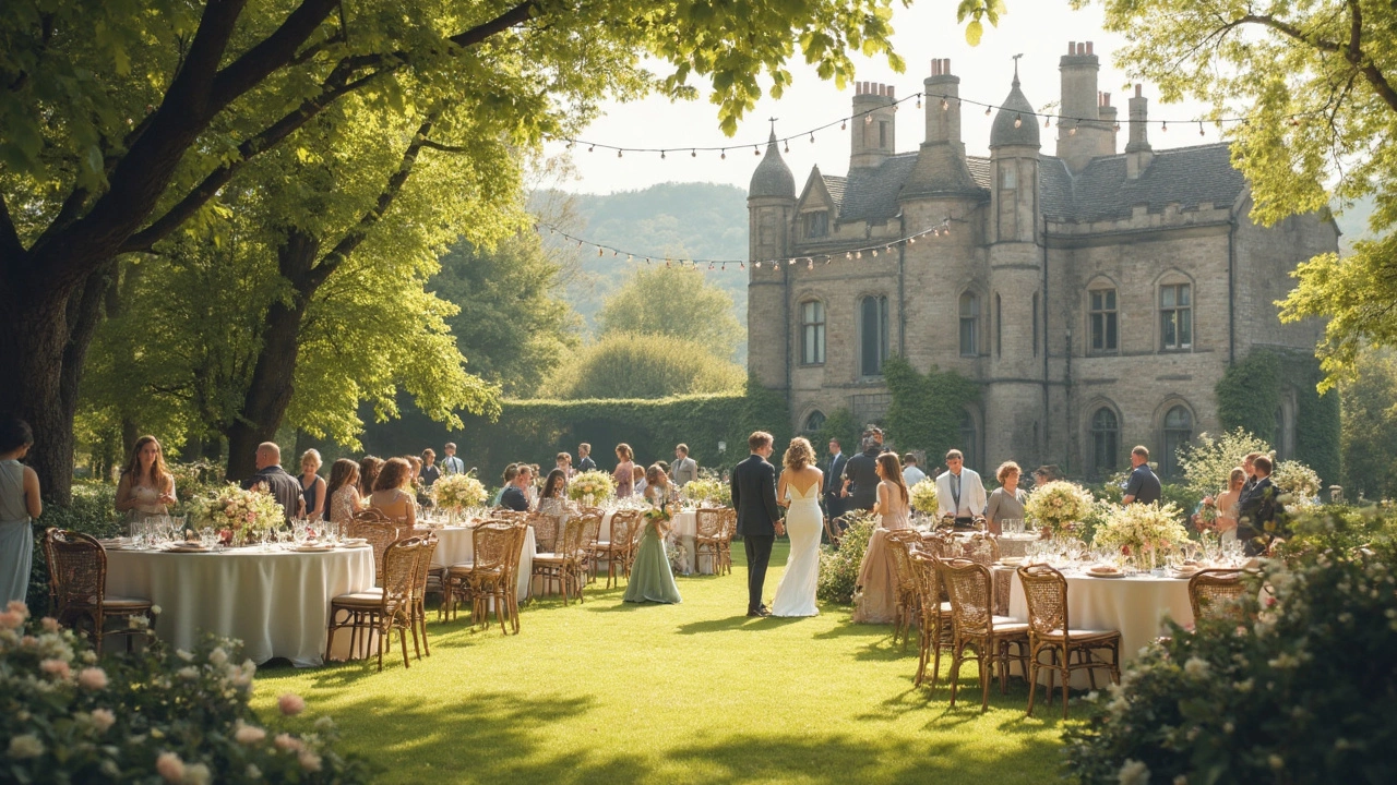
You’d think picking the most beautiful color for a wedding would be simple, but walk into any fabric or home store and you’ll see just how tough it can get. There are hundreds of shades—plus all the pressure to create a look everyone will remember. It’s not just about what’s trendy; it’s about setting a mood, reflecting who you are as a couple, and making your photos pop for years to come.
Let’s get practical. Color shapes your entire celebration, whether you’re after classic elegance, modern vibes, or something a little wild. Before you get swept into the “which shade of pink” debate, start with one key question: What do you want your wedding to feel like? Calm and dreamy, bold and lively, or maybe cozy and laid-back? Often, the right color makes everything feel just right, from your bouquets to your table settings.
- Why Color Choice Matters for Weddings
- Timeless Wedding Colors That Always Wow
- How to Pick the Best Color for Your Celebration
- Seasonal Color Inspiration for Every Couple
- Mixing and Matching: Pro Tips for a Stylish Palette
Why Color Choice Matters for Weddings
The color scheme is one of the first things people notice at any wedding. It sets the mood and tells guests a lot about what kind of party they’re walking into. Whether you go for bold jewel tones or stick with something neutral, picking a wedding color affects everything—decor, outfits, flowers, even how your photos turn out.
Colors aren’t just there for looks. There’s science behind them. Studies show certain colors can actually change how people feel. For example, soft blues and greens are calming and help create a relaxed atmosphere, while reds and golds can bring energy and excitement. When you’re figuring out your wedding decorations, keep in mind that color helps control the vibe.
Beyond feelings, color choices also make your wedding feel pulled together. Seeing the same pop of color in your invites, linens, and bouquets tells guests you actually put thought into it. And let’s be honest, a strong wedding palette can make even a basic space look special. If you’re working with a tight venue, a good color can do the heavy lifting for you.
- Photos matter—a lot. Choosing the right wedding color makes your photos look timeless instead of dated.
- Matching your palette to the season or location can make everything click together without extra effort.
- Even small details, like napkins or candles, feel intentional when they fit your color plan.
If you’re curious about what’s most important to couples, check this out:
| Top Priorities When Planning | % of Couples (2024 Survey) |
|---|---|
| Color Scheme | 62% |
| Venue | 58% |
| Dress Style | 45% |
So, when you’re picking out that wedding color, you’re not just picking what looks good. You’re deciding how your whole wedding will feel and how people will remember it. And that’s a pretty big deal.
Timeless Wedding Colors That Always Wow
Certain wedding colors have serious staying power. No matter how trends shift, these shades keep popping up every year because they never look dated in photos and always make a statement. If you want your wedding decorations to feel classic but not boring, these are your go-tos.
Ivory and White—the ultimate classics. Most couples lean on these for their wedding palette because they work with any theme, season, or venue. Fun fact: According to The Knot’s 2024 Real Weddings Study, 57% of weddings featured ivory in some way. It’s a neutral that never clashes and always feels crisp and polished.
Blush Pink stays at the top of the pretty list year after year. It’s soft, romantic, and pairs with bolder shades—think navy or burgundy—without stealing the show. Blush also looks great on everyone, so you’ll never have cranky bridesmaids refusing their dresses.
Champagne and Gold add a little extra glam without looking over-the-top. They blend easily into rustic barns, fancy hotels, or even backyard celebrations. Fun tip: Throw in gold accents for your table settings or invitations to level up your theme instantly.
Navy and Dusty Blue give serious style to modern and classic weddings alike. Navy is deep, sophisticated, and contrasts beautifully with greenery or metallic accents. Dusty blue is having a moment, too—according to wedding planners at Brides.com, "Blue tones give a calm yet stylish twist to any event."
"Classic wedding colors like blush, white, and navy never fade in popularity because they look great in any setting and on anyone," says celebrity wedding planner Mindy Weiss.
Let’s not skip Sage Green. Green is everywhere right now, but softer tones like sage or eucalyptus have true staying power. They make your wedding palette look lush and natural, especially if you’re planning an outdoor ceremony.
| Classic Color | Popular Pairings | Best For |
|---|---|---|
| Ivory/White | Greenery, Blush Pink, Navy | All seasons, all venues |
| Blush Pink | Gold, Silver, Burgundy | Spring, Summer |
| Navy Blue | Ivory, Gold, Dusty Blue | Fall, Winter |
| Champagne/Gold | Blush, White, Burgundy | Evening, Luxe weddings |
| Sage Green | Ivory, Dusty Rose, Terracotta | Outdoor, Garden themes |
If you want your wedding planning to go smoother, start with these tried-and-true shades and personalize from there. Add in pops of your favorite colors or stick to the classics for a look that never feels forced or outdated.
How to Pick the Best Color for Your Celebration
If you’re stressing about the wedding color for your big day, take a breath. You don’t have to follow anyone else’s rules—this is about you and what feels right for your celebration. Still, there are a few smart ways to actually figure out what looks best.
Start by looking at your venue. Is it loaded with natural light, or does it feel more industrial and cool? Outdoor spots with greenery work well with softer pastels or earthy tones; modern spaces can handle bold colors like deep navy or emerald. Pay attention to what’s already there—sometimes a venue’s carpet or wall color can totally clash with your original plan.
Consider the time of year. Lighter colors like blush or lilac pop in the spring. Summer weddings look great with brighter shades like coral, seafoam, or sunflower yellow. Fall pairs well with richer tones (think burgundy or burnt orange) and winter calls for dark greens, navy, or even metallics.
Don’t overlook what you already love. Open your closet—what color do you always wear that makes you feel confident? Check your social media photos or even your living room. If you gravitate toward certain shades, it’s smart to pull those into your wedding palette.
- Check inspiration boards, but trust your gut. Pinterest is a start—not the rulebook.
- Get swatches before making big purchases. Some colors look way different in real life or under different lighting.
- Ask your florist and planner for advice, especially if you want strange combos—they know what actually works together for wedding decorations.
- See how your color will look in photos by searching wedding albums or social accounts that match your venue or vibe.
If you’re curious how common your top picks are, check out this data from a major wedding planning site’s 2024 report:
| Color | Percentage of Couples Choosing It |
|---|---|
| Blush Pink | 23% |
| Navy Blue | 19% |
| Sage Green | 16% |
| Burgundy | 12% |
| Champagne | 11% |
At the end of the day, the most beautiful color is the one that feels right every time you see it, whether you’re looking at your bouquet or sneaking a peek at your wedding photos years later.
Seasonal Color Inspiration for Every Couple
Choosing the right wedding color gets way easier when you let the season lead the way. Every time of year comes with its own natural palette, which helps narrow down your options and guarantees your decorations look like they belong. Here’s what actually works best, season by season.
Spring weddings are basically made for pastel palettes. Think blush pink, soft lavender, mint, light blue, and peach. These shades feel fresh and inviting, and they actually photograph really well against typical spring blooms. If you want your wedding decorations to give off happy, romantic vibes, spring colors are always a win.
When summer rolls around, it’s prime time for bold and bright. Picture coral, hot pink, turquoise, sunny yellow, or even unexpected combos like orange and fuchsia. These colors bring a ton of energy, which is perfect if you’re planning a lively dance party or an outdoor bash. Want your wedding color to pop in every photo? Summer shades get it done.
Fall weddings usually lean into rich, earthy tones—think burgundy, deep green, burnt orange, and mustard. These colors cozied up with gold accents look awesome in barn venues or any outdoor setting. Fun fact: a survey by The Knot in 2023 found that burgundy was chosen by over 30% of couples having fall weddings. There’s something about those moody, autumn colors that just feels right once the weather cools down.
Winter doesn’t have to mean just red and green. Sure, classic winter colors like deep emerald or ruby are popular, but icy shades like steel blue, silver, deep navy, and even crisp white with metallic touches work wonders. If you’re after a sleek, elegant vibe for your wedding, winter palettes are seriously underrated.
| Season | Popular Colors | Great For |
|---|---|---|
| Spring | Blush, Peach, Mint, Lavender | Fresh, airy decor |
| Summer | Coral, Turquoise, Yellow, Fuchsia | Fun, vibrant celebrations |
| Fall | Burgundy, Burnt Orange, Mustard, Forest Green | Cozy, rustic themes |
| Winter | Emerald, Navy, Silver, White | Classic, elegant events |
The awesome part about following the seasons for your wedding palette is you’re not just picking colors out of thin air. You’ll have an easier time finding flowers and décor that match, plus your whole day will have a natural, put-together look—whether you’re going for timeless or totally modern.
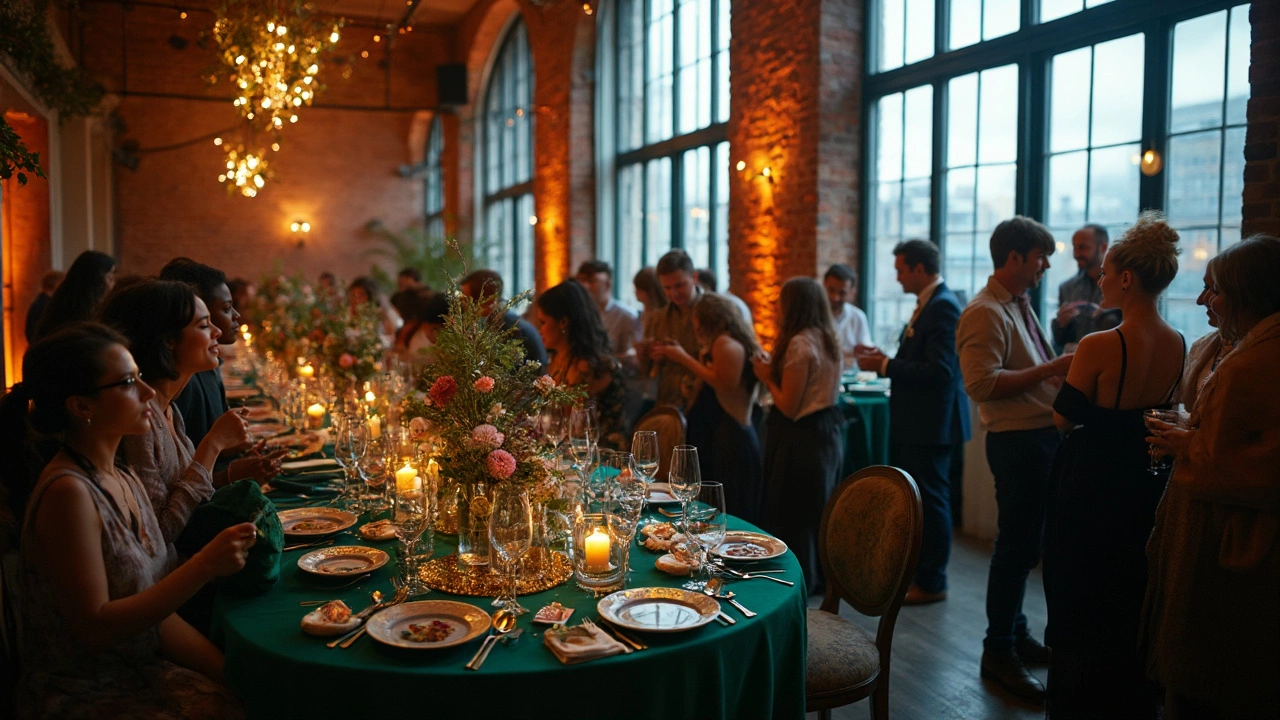
Mixing and Matching: Pro Tips for a Stylish Palette
Picking one color? That’s rare these days. Most couples go for a whole palette—it just looks richer and way less cookie-cutter. But mixing and matching can get messy if you don’t have a plan. Here’s how to nail a wedding color scheme that stands out for all the right reasons.
- Start with a base color. Choose one main shade that you love, and build around it. Neutrals like blush, ivory, or navy make great anchors because they play nice with bolder details.
- Stick to three to five colors. Any more starts to feel chaotic. For most wedding decorations, this mix gives you enough variety without going overboard.
- Use the 60-30-10 rule. Pros swear by it: 60% of your dominant color, 30% of a secondary color, and 10% of an accent. It keeps everything balanced. Your tablecloths, for example, might be your main color, while flowers and napkins pull the other two.
- Think about textures and finishes. A matte sage green looks different from a shiny one. Mixing textures—even if the color’s similar—makes a palette feel layered and interesting.
- Look at color combos that work. Navy and blush, dusty blue with gold, or even emerald green and peach—these are stunning pairings that are trending right now in wedding planning circles.
Seeing it all together matters more than you’d think. Designers use digital collage tools and sample boards all the time, so you don’t end up with clashing linens and flowers. And if you’re not sure, go check out real-life setups at your venue (or social media accounts of couples who've used the space) to get ideas of what blends well in the light at that spot.
| Palette Name | Main Color | Accent Colors | Best For |
|---|---|---|---|
| Modern Romance | Blush Pink | Ivory, Gold, Sage | Spring & Summer |
| Classic Elegance | Navy Blue | Burgundy, Silver, White | Fall & Winter |
| Fresh & Bold | Emerald | Peach, Coral, Cream | Summer |
| Boho Chic | Terracotta | Mauve, Olive, Beige | All Year |
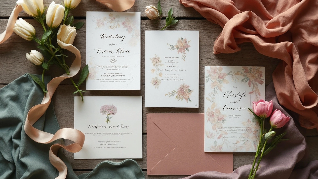
Quick tip: Bring fabric swatches or save digital color codes when shopping for decor so everything lines up. About 75% of couples say their top regret was not double-checking stuff in person before ordering online, according to a big survey last year.
Play around, but keep your big picture in mind. The best wedding palette doesn’t just look pretty—it helps tell your story from the aisle to the after-party.