Wedding Invitation Palette Designer
Visual Preview
Save the Date
Together with their families,
The Happy Couple
request the honor of your presence
Главные выводы / Key Takeaways
- Match the mood: Use colors that reflect the emotion of the day (e.g., pastels for romance, bold tones for energy).
- Seasonality matters: Align your palette with the time of year to make the event feel cohesive.
- Readability is king: Always ensure high contrast between the card color and the ink.
- The 60-30-10 rule: Use a primary color for 60%, a secondary for 30%, and an accent for 10%.
The psychology behind your palette
Before you start scrolling through Pinterest, think about how you want people to feel when they open that envelope. Colors trigger immediate emotional responses. For instance, White is the traditional choice for weddings, symbolizing purity, clarity, and a fresh start. It's a safe bet, but it can feel a bit sterile if you don't pair it with something warmer.
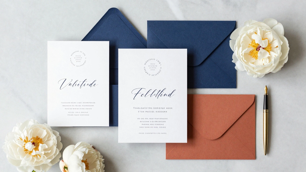
If you want a vibe that feels sophisticated and timeless, Navy Blue is a power move. It conveys trust and stability, making it a favorite for formal evening weddings. On the flip side, warm tones like terracotta or dusty rose evoke feelings of comfort and intimacy, which is why they're so popular for backyard or rustic ceremonies.
Matching colors to the season
Your wedding date is a huge clue for your color choice. Using colors that clash with the season can feel jarring. Imagine receiving a deep burgundy and forest green invitation in the middle of July-it feels a bit heavy for a summer breeze.
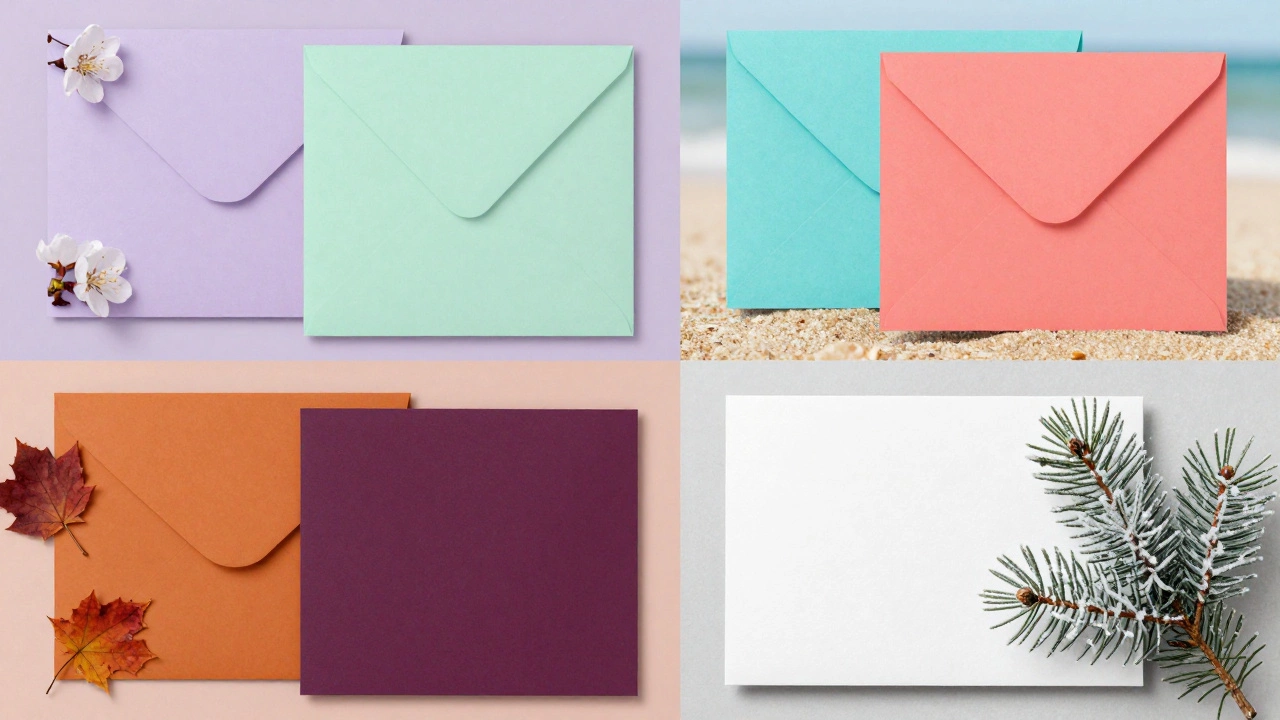
For a spring wedding, lean into the colors of renewal. Think soft lavender, mint green, or buttery yellow. These colors mirror the blooming environment and feel light and airy. Summer is your chance to go bolder. Vibrant corals, turquoise, or even a bright fuchsia can work well, especially for beach or destination weddings. Pastel Colors are a type of color scheme characterized by high lightness and low saturation, which keeps summer invites from feeling overwhelming.
When autumn hits, the world turns gold and copper. Your invitations should follow suit. Deep plums, burnt oranges, and mustard yellows feel grounded and cozy. Finally, winter weddings call for high contrast. A crisp white card with silver or gold foil, or a deep emerald green, mirrors the stark beauty of the colder months.
Coordinating with your venue and theme
Your venue is a physical entity that already has its own color palette. If you're getting married in a ballroom with gold moldings and cream carpets, a neon lime green invite will feel out of place. You want your stationery to act as a bridge between the guest's home and the venue.
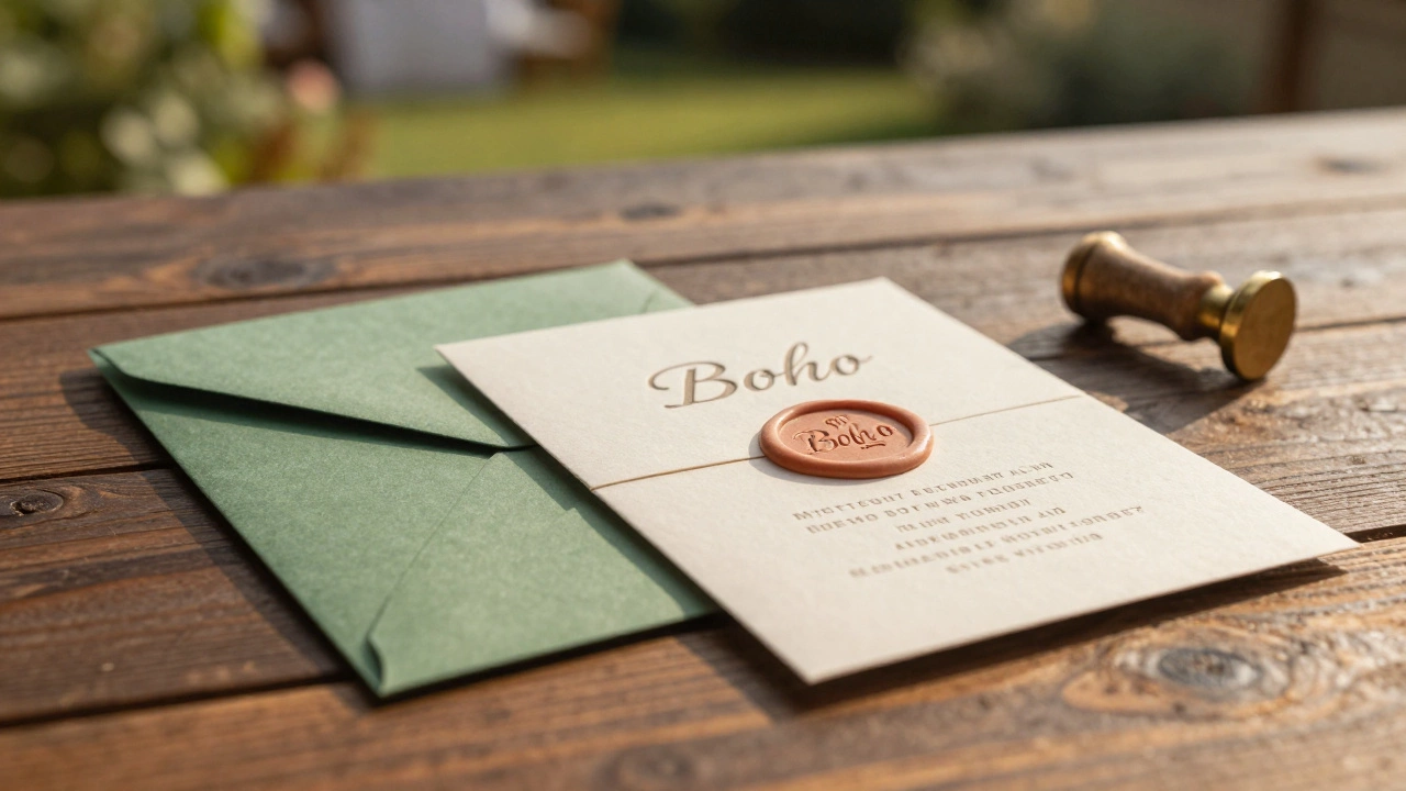
Consider the Wedding Theme, which is the overarching visual and conceptual style that guides the decor, attire, and atmosphere of the wedding. If you're going for a "Boho" look, you'll likely want earthy tones like sage, cream, and clay. For a "Modern Minimalist" theme, a monochrome palette-black, white, and gray-is the way to go.
| Vibe | Primary Color | Accent Color | Suggested Finish |
|---|---|---|---|
| Romantic/Classic | Blush Pink | Gold | Letterpress / Vellum |
| Moody/Dramatic | Emerald Green | Copper | Velvet / Heavy Cardstock |
| Modern/Sleek | Charcoal Gray | White | Matte / Acrylic |
| Rustic/Natural | Sage Green | Cream | Recycled / Kraft Paper |
The technical side: Readability and Contrast
Here is where most people trip up: they pick a beautiful color and then pick an ink color that's too similar. If you choose a light gray card and use white ink, your guests will be squinting at the paper trying to figure out where the party is. This is especially problematic for older relatives.
The rule of thumb is high contrast. Dark paper requires light ink (white, gold, silver), and light paper requires dark ink (black, navy, deep plum). If you're using Foiling, which is a printing technique where a thin layer of metallic foil is pressed into the paper, remember that it adds a reflective element that can either enhance or distract from the color.
Don't forget about the envelope. The envelope is the "teaser." A colored envelope with a white card inside is a classic move. Alternatively, using a liner-a piece of colored or patterned paper inside the envelope-allows you to introduce a second or third color from your palette without making the main invite look too busy.
Avoiding common color mistakes
One big mistake is trying to use too many colors. When you mix five or six different hues, the invite starts to look like a flyer for a kid's birthday party. Stick to a limited palette. A primary color, a secondary color, and one metallic or neutral accent is usually plenty.
Another pitfall is ignoring the lighting of your venue. Some colors look great on a computer screen but look muddy in real-life lighting. Always order a physical sample. A "dusty rose" on a screen might actually look like a "muted brown" when printed on Cardstock, which is a thicker, more durable type of paper used for postcards and invitations.
Lastly, be careful with "trend' colors. While a specific shade of green might be the "color of the year" on social media, will it look dated in your wedding album in ten years? If you're worried about longevity, keep the base color neutral and use the trendy color in the smaller details, like the wax seal or the ribbon.
Putting it all together: Your decision process
If you're still stuck, start from the center and work your way out. First, identify your venue's dominant colors. Second, pick the mood you want to convey. Third, check your wedding date for seasonal cues. Once those three align, you'll likely find a color that feels inevitable.
For example, if you have a garden wedding in June (Summer/Airy) at a venue with white stone walls (Neutral/Light) and you want a romantic feel (Blush/Soft), a combination of blush pink and sage green with gold accents is a logical choice. It fits the environment, the season, and the emotion.
Do the invitations have to match the bridesmaid dresses?
They don't have to be an exact match, but they should be in the same color family. If your bridesmaids are wearing deep burgundy and your invites are neon yellow, it will feel disconnected. Aim for complementary colors-shades that look good together on a color wheel-rather than identical matches.
Is white still the best choice for wedding invitations?
White is a timeless classic because it's clean and professional. However, many modern couples prefer "off-white," "cream," or "ivory" because they feel warmer and more expensive. Pure white can sometimes look a bit like office paper if the quality of the cardstock isn't high.
Can I use black wedding invitations?
Yes, but they are a bold choice. Black invitations are perfect for "black-tie" or evening events. Just be aware that black ink on black paper isn't possible, so you'll need to use metallic foil or white ink. Also, keep in mind that in some cultures, black is associated with mourning, so consider your guests' backgrounds.
How many colors is too many for one invite?
Generally, sticking to three colors is the sweet spot. This usually consists of one dominant color, one supporting color, and one accent color (like gold or silver). Going beyond four colors often makes the design feel cluttered and less sophisticated.
What color should the envelopes be if the cards are colorful?
If your cards are very bright or bold, a neutral envelope (white, cream, or kraft) helps balance the look. If your cards are neutral, a bold colored envelope is a great way to add a pop of personality and make the mail stand out in your guests' mailboxes.