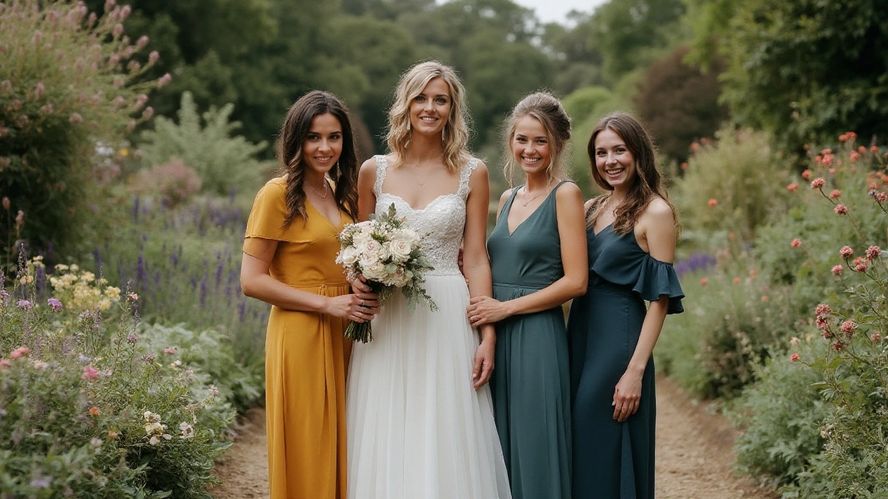
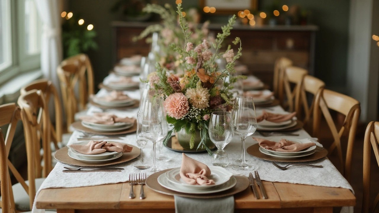
Wedding planning is a creative journey where every choice, including colors, carries a significant weight. While many couples gravitate toward popular hues like soft pastels or rich jewel tones, others might think about colors that don't often make it to the 'most chosen' lists. These colors, often called least popular, can offer a refreshing deviation from the norm.
The allure of unpopular colors might not immediately resonate with everyone. However, they hold potential for crafting unique and memorable design palettes. Whether it's the soft touch of mustard or the evocative deep green, venturing beyond the tried-and-true could bring a personalized touch to your celebration.
Imagine walking into a venue decorated with shades that break traditional expectations, sparking intrigue and admiration. This article delves into these less common choices, highlighting their understated beauty and providing practical tips on how to blend them seamlessly into your wedding day narrative.
- The Essence of Wedding Color Choices
- Colors That Get Left Behind
- Unique Charm of Unpopular Colors
- Incorporating Least Popular Shades
- Tips for Balancing Bold and Subtle Colors
The Essence of Wedding Color Choices
Choosing wedding colors is like painting the backdrop of your love story; it reflects the unique flair of the couple. The process of selecting these colors is not merely an aesthetic choice but an emotional expression, an opportunity for the couple to showcase their personalities, beloved memories, and shared dreams. This is why wedding colors are more than just a combination of shades and hues - they are woven into every element of the wedding day, from the invitation designs to bridesmaid dresses and floral arrangements. In a landscape dominated by trending palettes, where blush pinks and navy blues reign supreme, it becomes all the more pivotal to explore colors with personal resonance, even if they aren't the most popular choices.
The psychology behind colors is fascinating and complex. Colors invoke emotions and feelings, which can set the tone for the wedding day. For instance, bold reds signify love and passion, while serene blues can create an atmosphere of tranquility and trust. Even subtler shades like sage or lavender, often deemed "least popular," can convey understated elegance and simplicity. These choices can tell an untold story about the couple's shared history or symbolize something deeply meaningful. The right color choice adds coherence and harmony, binding the elements together like a beautiful, organized symphony.
Why then, do some colors remain unpopular? Historical trends play a role, as well as societal associations and cultural norms. Many couples choose not to stray too far from the palettes seen in recent weddings because there is a comfort in tradition. However, for those willing to take daring steps, these "least popular" colors may offer the potential for a one-of-a-kind celebration. Colors such as mustard yellows, muted browns, or intricate teal often remain uncharted territories for weddings, yet they present a unique opportunity to stand out.
"Color is a power which directly influences the soul," said painter Wassily Kandinsky. This sentiment invites us to rethink how we choose and perceive colors in weddings and life.
A couple selecting colors should consider not only their personal preferences but how these colors resonate within the wedding's environment, like the venue's architecture, the season's blooms, and ambient light. It involves some creative risk, but the reward is a wedding that feels authentically representative of the couple. Couples are encouraged to use color wheels or professional design tools to visualize combinations if they're hesitant. Engaging the help of wedding planners or color consultants can also facilitate conversations about leveraging these less popular shades or integrating them into a broader, cohesive theme.
Ultimately, the true essence of wedding color choices lies in their power to reflect a couple's spirit and create a mood that guests will remember long after the last slice of cake is served. In embracing the bold decision to stray from the norm and consider the least popular options, these couples redefine what it means to craft a personal and memorable celebration. The possibilities really are as endless as the shades on a color wheel, offering infinite avenues for creativity and self-expression.
Colors That Get Left Behind
In the vast spectrum of wedding colors, some hues often find themselves overshadowed by their more popular counterparts. While shades like blush pink, navy blue, and classic white dominate the wedding scene, others quietly linger in the background, awaiting their moment of spotlight. Understanding why certain colors don't make it to the wedding palette as often can reveal much about societal trends, cultural influences, and individual perceptions of beauty.
One of these forgotten colors is mustard yellow. While it exudes a warm, bohemian charm suitable for an autumn ceremony, it surprisingly remains a rare choice for brides and grooms. Mustard can seem overpowering at first glance, but when paired with softer accents like cream or sage, it develops into an intriguing and rich palette. It's interesting to note how different cultures embrace various tints differently. In some Eastern traditions, yellow symbolizes joy and positivity, yet it struggles to find its place in a Western wedding design.
Avocado green is another shade that rarely graces the guest list of wedding colors. It draws its quirks from its retro 1970s vibe, which can be off-putting to those with a modern aesthetic in mind. Yet, in the right context, avocado can evoke a sense of nostalgic elegance. Consider blending avocado with gold accents for a gilded age appeal, highlighting its potential to thrive in a luxurious setting.
"The underestimated palette of earth tones brings a sophisticated edge to contemporary weddings," notes interior designer Leah Thompson, renowned for her groundbreaking color theories.
Moreover, periwinkle, a complex blend of blue and lavender, carries an ethereal quality that can uplift a wedding ceremony to realms of fantasy. Its subtlety might be the very reason it doesn't appear often—it requires a delicate balance to avoid overshadowing or being overshadowed. However, when matched with metallics or a deep navy, it brings a soft, whimsical atmosphere that is hard to replicate with other colors. This versatility, though underappreciated, can transform typical settings into enchanted visions.
To provide a clearer insight into these hidden gems, let's examine a comparison of color preferences by popularity over the past decade:
| Year | Top Trending Color | Least Popular Color |
|---|---|---|
| 2015 | Blush Pink | Mustard Yellow |
| 2018 | Dusty Blue | Avocado Green |
| 2021 | Terracotta | Periwinkle |
These overlooked colors, while not mainstream, offer immense opportunities for couples to make their weddings unique and memorable. Embracing them might seem daunting, but with thoughtful planning and creative vision, they can provide a refreshing and personal touch that stands apart from conventional preferences. Thus, while lesser chosen, they are in no way lesser capable of creating stunning and unforgettable wedding aesthetics.

Unique Charm of Unpopular Colors
When we think of weddings, the image often painted in our minds takes on the hues of classic shades like blush pink, sage green, or navy blue. However, the spectrum of wedding colors available to transform your day is vast and breathtaking, including some that are typically less favored. These lesser-chosen hues may initially seem unconventional, yet their rich tones possess a unique charm that can make your wedding decor truly unforgettable. For instance, hues such as mustard yellow, olive green, and even slate gray offer a sophisticated appeal that can weave a modern and fresh narrative for nuptials.
Mustard yellow, for instance, is not merely a bold hue but a bridge between vintage and contemporary aesthetics, perfect for couples wanting to carve out a signature look. The warmth of this color complements various themes, from rustic barn weddings to elegant art deco gatherings. The mood it sets is vibrant yet relaxingly cozy, making it an excellent choice for autumn or late summer ceremonies. An eloquent acknowledgment of its unique role in decor was captured by color expert Leatrice Eiseman, director of the Pantone Color Institute, who remarked, "The right mustard shade can be both grounding and uplifting, offering a delightful balance."
Moreover, olive green has that understated allure, effortlessly blending the serenity of nature into the wedding layout. It's a color deeply connected to peace and harmony, often associated with lush Mediterranean landscapes. It pairs elegantly with metallics like gold or copper, accentuating the leafiness of floral elements while adding depth to the overall palette. Events that embrace olive tones exude a timeless grace and are delightfully memorable for their unique yet subtle palette. This shade's adaptability speaks to its resilience as a backdrop or even the central theme.
Another underappreciated color is slate gray. Its versatility is unmatched, providing a harmonious base that highlights more vibrant colors or standing alone as a testament to minimalistic beauty. The neutral tone of slate gray offers a clean, sleek move away from tradition, ideal for modern, urban weddings where simplicity reigns supreme. It can build sophistication into any wedding color scheme, effortlessly matching with deep reds for wintery elegance or soft pastels for a spring-time affair. This palette is not only chic but sets a tone of understated elegance, resonating with guests long after the event.
Choosing unique wedding decor often involves a step away from the familiar, ushering in hues that may not initially appear at the top of everyone's list but carry the potential for captivating expression. Each choice tells a story about the couple and adds layers of meaning to their special day. Embracing these lesser-known colors can be a liberating milestone, giving couples the courage to personalize their celebrations in nuanced and surprising ways. While some might shy away from the unknown, these unique colors may be precisely what is needed to make a significant and lasting impression.
Incorporating Least Popular Shades
Choosing to incorporate least popular wedding colors into your celebration can become a delightful journey of creativity and personalized touch. These colors, often overlooked by many, possess the power to transform an ordinary setting into a magical space that resonates with individuality and charm. The secret lies in the thoughtful execution, where each hue finds its rightful place within the broader design. To start, consider the venue and season of your wedding. Some of these lesser-chosen shades naturally complement certain settings; for instance, a muted mustard can harmoniously blend into an autumnal outdoor ceremony, while a deep green might shine beautifully against a winter wonderland backdrop.
As you delve into the world of underestimated hues, think about the thematic story you wish to tell. A fantastic approach is using these colors as accents. They can pop against more neutral or complementary backdrops, allowing them to stand out without overwhelming the senses. Experiment with texture and materials to bring these shades to life. For example, bridesmaids' dresses in a subtle chartreuse might feel vibrant and refreshing when paired with gold accessories and floral arrangements that blend creams and whites with green foliage.
According to Color Theory expert Jill Morton, "Choosing unusual colors in weddings invites a sense of unexpectedness and originality that can leave lasting impressions."
Innovative lighting can also play a pivotal role, often elevating the interaction of colors within a space. Consider using fairy lights or colored LED fixtures to enhance the ambient aura of these unique tones. This way, light becomes a tool not just for visibility but also for storytelling, crafting moods that complement your color choices. Now, how do these colors find their way into stationery, table settings, and other details? Opt for these shades in table napkins, chair sashes, or even within your invites to set an early tone for what guests can expect. Couples might experiment by pairing unpopular colors with metallic shades like silver or gold to add an element of elegance and sophistication.
| Color | Occasion | Suggested Combinations |
|---|---|---|
| Mustard | Autumn | Ivory, Burgundy |
| Deep Green | Winter | Gold, Cream |
| Chartreuse | Spring | Coral, Navy |
When integrating these shades, balance remains as crucial as ever. It is essential to keep an eye on the interaction between light and color across different parts of the ceremony and reception. Testing samples before finalizing choices gives a better sense of how everything will come together. Consider mood boards for your designs, which can help visualize the complete look before implementation. The idea is to allow these unique wedding colors to be part of a cohesive narrative that pairs well with your overall aesthetic.
In essence, the charm of these colors lies in their ability to surprise and enchant guests by stepping away from conventional palettes. As wedding trends evolve, embracing such unique choices can set a tone for creativity and non-traditional elegance. Remember, it's not merely about following trends but about creating a celebration that truly reflects your personal values and aesthetics. This approach not only personalizes your wedding but also turns it into a one-of-a-kind experience that both you and your guests will cherish for years to come.

Tips for Balancing Bold and Subtle Colors
When planning your wedding decor, the interplay between bold and subtle colors can create a harmonious and visually captivating atmosphere. Combining the bold and the delicate isn’t just about picking shades that clash or complement; it’s about crafting an experience that resonates with your personal story. To strike the perfect balance, it’s essential to understand the mood and tone you wish to set for the ceremony and reception. Start by identifying the anchor color—the one you feel drawn to. This could be anything from a vibrant coral to a stately navy. Use this as the base around which lighter, subtler colors revolve to evoke contrast and harmony in each glance.
One effective strategy is the 60-30-10 rule, frequently employed by interior designers and wonderfully adaptable for wedding functions. It prescribes that 60% of your wedding space should be dominated by a primary color; 30% by a secondary color; and 10% by an accent color. For instance, if sage green is your primary shade, roping in muted gold as the secondary color along with a pop of cranberry for accents could introduce a tasteful yet vibrant appeal. These ratios help maintain aesthetic order and prevent overpowering visual chaos from too many competing tones.
Continuing with techniques from the art and fashion worlds, consider the textures and materials associated with each color you select. A deep burgundy velvet contrast against soft cream linens strikes a sophisticated yet relaxed ambiance. Think about how fabric and florals interact under both natural and artificial lighting. As design guru Nate Berkus once said,
"Your home should tell the story of who you are, and be a collection of what you love."This sentiment seamlessly translates into wedding decor, encouraging you to integrate elements that speak to your personality through touch as much as sight.
Another inventive approach entails employing bold shades within unexpected elements. Perhaps the groomsmen’s ties or bridesmaids’ shoes sport that daring persimmon orange you've hesitated to use broadly. This not only keeps the audacious hues from overpowering the atmosphere but also adds delightful pops of surprise that guests will appreciate. Layering is crucial here; alternating a lively hue with softer tones in floral arrangements or table settings can ensure every place setting or center stage feels intentional and cohesive.
Moreover, don’t underestimate the ability of metallics as mediators among colors. Silver and gold can act as neutralizers when placed with bold palettes, while a touch of rose gold offers warmth alongside cool colors like teal or lavender. If you’re tracking current trends, consider consulting a Pantone Color of the Year guide to stay contemporary while blending varied palettes. Wedding website The Knot highlights that wedding colors drawn from such trends often resonate not just with the couple, but align with modern aesthetics seen across various design industries.

