Wedding Palette: How to Choose the Perfect Colors
Picking a color scheme feels huge, but it doesn’t have to be stressful. Start by asking yourself three simple questions: What vibe do you want? Which season are you marrying in? And what’s already fixed – like the venue walls or the bride’s dress? Answering these gives you a shortcut to a palette that actually works.
Seasonal Color Inspiration
Each season brings its own natural palette. Spring weddings love soft pinks, lavender, and fresh greens – think lilac fields and new leaves. Summer calls for bright corals, turquoise, and sunny yellows that pop against outdoor backdrops. Autumn is perfect for burnt orange, deep burgundy, and mustard; these tones echo turning leaves and give a warm, cosy feel. Winter weddings shine with icy blues, charcoal, and rich jewel tones like emerald or ruby. Use these seasonal cues to narrow down your choices fast.
Putting the Palette to Work
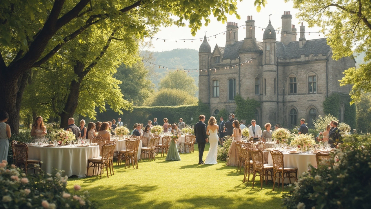
Once you have a base hue, spread it across the big elements: flowers, décor, attire and stationery. For flowers, follow the rule of three – pick one dominant shade, one secondary, and a tiny accent. A classic rule: match the bride’s bouquet to the overall palette, not the other way around. If your main color is dusty blue, pair it with soft peach buds and a splash of ivory for contrast.
Groom and groomsmen suits are easier than you think. Instead of matching everyone exactly, choose a common thread. For a navy‑based palette, a navy suit with teal or gold pocket squares ties the look together without looking uniform. If you’re leaning on pastel tones, light grey or beige suits work, letting the boutonnieres carry the color story.
Don’t forget the little things – napkins, ribbons, candles, even the RSVP cards. A cohesive palette makes the venue feel intentional, and guests will notice the detail. When in doubt, use a neutral base (cream, ivory, soft grey) and let your chosen colors pop as accents.
2024 is all about daring yet elegant shades. Think muted teal, dusty mauve, and rich terracotta. These colors are versatile: they look stunning in both indoor ballroom settings and outdoor garden venues. Pair them with metallics like rose gold or brushed brass for a modern twist.
Finally, test your palette before you commit. Order a few fabric swatches, request a sample bouquet, or create a mood board on Pinterest. Seeing the colors side‑by‑side helps you catch clashing tones early. Trust your gut – if a combination feels right in real life, it will feel right on your wedding day.
With a clear seasonal guide, simple flower rules, and smart suit tips, you can craft a wedding palette that looks polished without the headache. Enjoy the process, and let your colors tell the story of your day.
Most Beautiful Color for a Wedding: Finding the Perfect Shade for Your Big Day
Trying to pick the most beautiful color for a wedding is tricky—everyone has their own style, but certain shades truly stand out for special moments. This article gets into what makes a wedding color ‘beautiful,’ highlights trending palettes, and gives practical tips for choosing colors that fit your vibe. You’ll learn what works for different seasons, how to match colors to your venue, and why some classic shades never go out of style. Take the guesswork out of picking the right tone with real insights and fun facts. Your wedding should feel like you, down to every last detail—including the colors you choose.
View More