Wedding Color Schemes: Ideas, Trends, and How to Use Them
Picking a color scheme feels like the first real design choice for your wedding. It sets the tone for everything from flowers to the groom’s suit. The good news? You don’t need a design degree to get it right. Below are clear steps and fresh ideas that work for any Bristol venue.
Choosing the Right Palette
Start with the season. Spring loves soft pastels—think blush, sage, and lavender. Summer leans toward bright hues like coral, teal, and sunshine yellow. Autumn brings warm tones such as burnt orange, deep burgundy, and moss green. Winter favors cool shades like navy, silver, and icy blue. Pick the season that matches your wedding date and use it as a colour guide.
Next, think about your venue. A historic church pairs well with classic whites and gold accents, while a modern loft looks great with bold contrasts like black and mustard. If you’re on the waterfront in Bristol, consider sea‑inspired tones—soft blues and sandy neutrals.
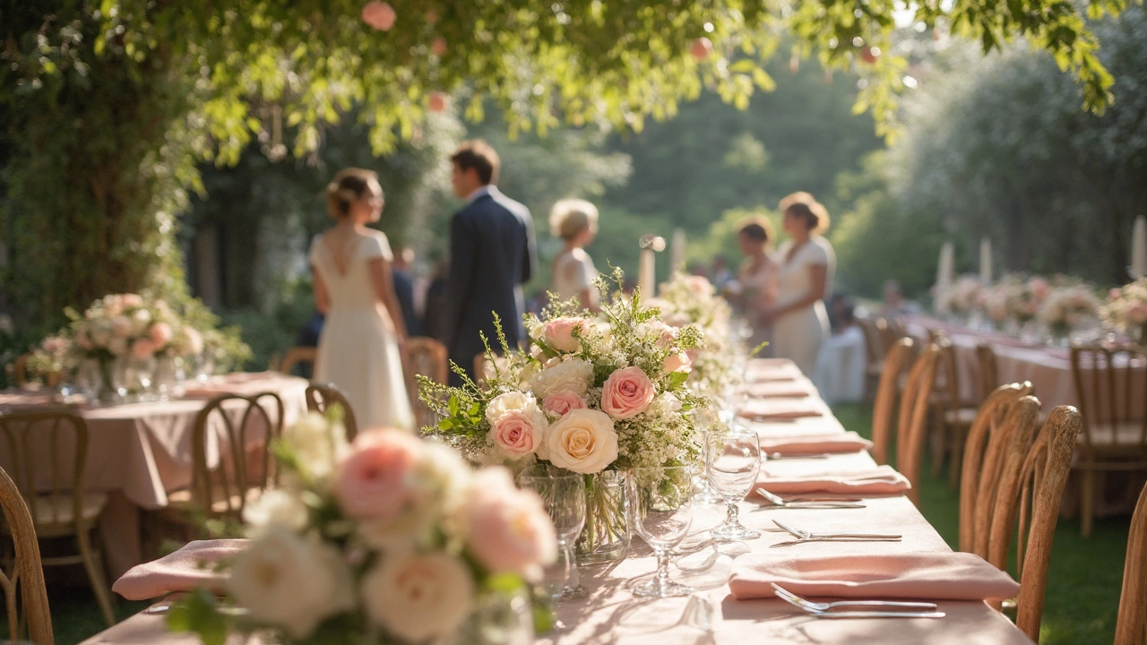
To keep the palette cohesive, limit yourself to three main colours. One dominant colour, one secondary, and one accent works every time. For example, navy (dominant), blush (secondary), and copper (accent) creates a sophisticated look without overwhelming guests.
Putting the Palette to Work
Flowers are the easiest way to display your scheme. Use the post “What Color Should Wedding Flowers Be?” as a cheat sheet: match the major hue for larger bouquets and add accents for filler blooms. If your main colour is emerald, choose roses or peonies in that shade and sprinkle in ivory filler for contrast.
The groom’s suit can reinforce the palette. The article “Choosing the Perfect Groom’s Suit Color” suggests picking a suit that echoes the dominant shade or the accent colour. A charcoal suit with a teal tie works well if teal is your accent colour. Don’t be afraid to try a coloured suit—navy or deep green can be striking when paired with neutral bridesmaids.
Table linens, candles, and stationery should follow the same rule. Choose tablecloths in the secondary colour, napkins in the accent, and keep ribbons or charger plates in the dominant hue. This creates visual harmony without over‑decorating.
If you love a pop of surprise, add a contrasting element in a small area—like a bright orange cake frosting on an otherwise muted palette. The post “2024 Wedding Color Trends” shows that a single unexpected hue can become a conversation starter.
Finally, test your palette before the big day. Order small samples of fabric, paper, and flower swatches. Lay them side by side in natural light to see how they interact. This quick check can save you from a clash you didn’t notice online.
Remember, the best colour scheme feels effortless because it reflects who you are as a couple. Use these steps, trust your gut, and enjoy watching your Bristol wedding come alive in the colours you love.
Best Color Choices for Wedding Decorations
Choosing the right colors for wedding decorations is crucial in setting the mood and tone for the big day. This article dives into how different colors can evoke emotions and create memorable experiences. It offers tips on selecting the right color schemes based on season, venue, and personal taste. Whether it's a romantic blush or a bold navy, the right choice can transform any venue into a stunning visual feast. Discover how to coordinate colors that complement the couple's personalities and theme.
View More