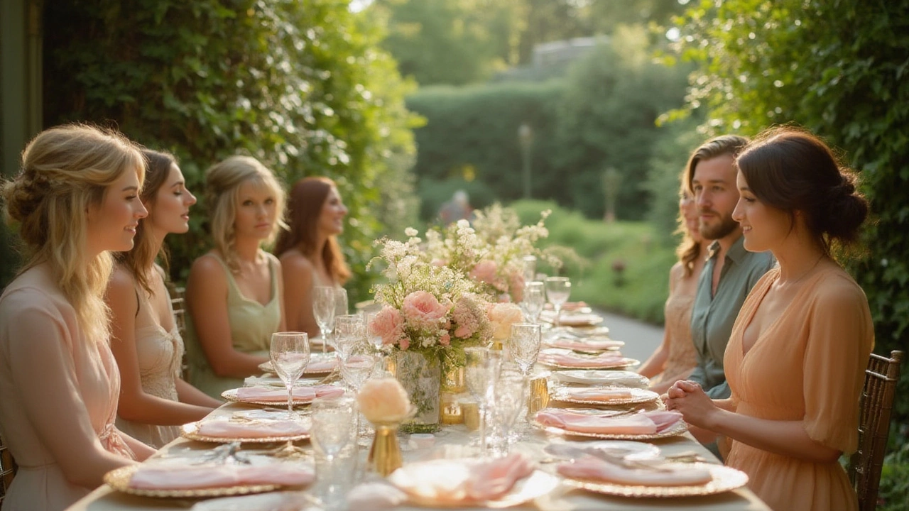
Wedding Color Trends for 2025: Fresh Palettes and Easy Tips
Choosing the right colors is one of the quickest ways to make your wedding feel personal and on‑trend. In 2025 the biggest moves are toward softer neutrals paired with bold accent shades. Think warm greys, muted sage, and dusty rose, then sprinkle in a pop of teal, mustard, or burgundy for drama. The good news? You don’t need a designer to pull it off – a few smart choices can tie everything together.
Seasonal Palettes to Try
Spring in Bristol brings blooming gardens, so natural greens and pastel pinks work wonders. Pair a sage‑green table runner with blush bridesmaid dresses, and match the bouquet to the same tones for a seamless look. Summer calls for brighter vibes – coral, navy, and sunshine yellow keep the energy high without feeling overdone. If you’re planning a fall wedding, look to rust, deep plum, and soft mauve; these hues echo the changing leaves and add a cozy feel.
Winter weddings can still be colorful. Instead of the classic white‑on‑white, try a charcoal base with icy blue accents or even a regal emerald. The contrast feels luxurious and keeps the space from feeling too stark.
How to Carry Your Colors Through the Day
Start with the most visible element – the flowers. The post “What Color Should Wedding Flowers Be?” breaks down palette rules, but the short version is to pick one main shade and two supporting tones. For example, a navy table arrangement can be softened with ivory roses and silver filler.
The groom’s suit is another canvas. Our guide on “Choosing the Perfect Groom’s Suit Color” suggests navy, charcoal, and deep green as safe bets that still feel fresh. If you love a pop, a subtle teal pocket square can echo the accent color in your décor.
Don’t forget the father of the groom. The “What Color Should the Father of the Groom Wear?” article recommends classic navy or charcoal with a tie that picks up the accent hue. It ties the whole party together without making anyone feel overdressed.
Even the photographer’s outfit matters. Wearing neutral tones like soft grey or muted navy helps the photographer blend in, as explained in “What Color Should a Photographer Wear to a Wedding?”. This keeps the focus on you, not on the crew.
Small details can make a big impact. Napkins, ribbon, and even the RSVP cards can carry an accent shade. If you’re on a tighter budget, swap out decorative flowers for draped fabric in your chosen color – it looks upscale for less.
Finally, test your palette. Print a small mood board or create a digital collage with Pinterest. Seeing the colors side by side helps you spot clashes before you commit to contracts.
With these simple steps, you can ride the 2025 wedding color wave while keeping the vibe true to you. Whether you’re a Bristol bride who loves pastel blooms or a groom who wants a splash of deep green, the right palette makes your day unforgettable.
2024 Wedding Color Trends: The Shades Stealing the Spotlight
Discover the 2024 wedding color that everyone is talking about, plus creative ideas, trend insights, and tips for bringing it into your celebration.
View More