Taboo Wedding Colors: Avoid These Mistakes for Your Bristol Wedding
Choosing a colour palette is one of the most fun parts of planning a wedding, but it can also be a minefield. Some shades look great in a mood board but turn awkward on the day. Below we break down the colours most couples in Bristol (and beyond) should think twice about, and give practical tips on how to fix or replace them.
Colors That Clash With Tradition
Black for the bridal party. Black is elegant at a gala, but most guests still see it as a mourning colour. If you love its sleek vibe, try charcoal or deep navy instead – you keep the drama without the negative vibe.
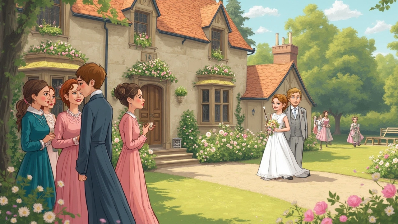
All‑white attire for guests. White is the bride’s signature, so it can feel disrespectful when friends show up in the same shade. Suggest pastel tones or soft greys for the wedding party and let guests know bright white is off‑limits on the invitation.
Neon brights. Neon pink, lime, or electric blue can dominate a venue and clash with natural lighting. If you want a pop of fun, use neon as an accent – like in the wedding cake topper, napkin edge, or a single floral arrangement – rather than the main dress code.
Red in certain cultures. In some traditions red signals mourning, while in others it’s a celebration colour. If you’re mixing cultures, talk to family elders about what works. A safe bet is a deep burgundy, which feels rich but less controversial.
Modern Takes: When Can You Break the Rules?
Wedding fashion is always evolving, and many couples successfully rewrite the colour rulebook. Here’s how to do it without shocking the crowd.
Black dress for the bride. It’s bold, modern, and perfect for an evening celebration. Pair it with gold or ivory accents to keep the look romantic. Make sure the venue’s lighting can highlight the texture of the dress – a dim hall can make black look flat.
Bright colour blocks. If you love saturated shades, split the palette. Use a bright colour for the bridal party and a softer hue for the décor. For example, teal dresses with peach centrepieces create a balanced, Instagram‑ready look.
Unconventional suit colours for the groom. Navy, forest green, or even a muted mustard can work great. The key is to match the groom’s suit with the overall palette, not the opposite. Ask your tailor to bring fabric swatches and compare them side‑by‑side with your flower and invitation colours.
Whatever colour you choose, always test it in the actual space. Bring a sample of the fabric or a printed swatch to the venue during the day you plan to hold the ceremony. Natural light can change how a colour appears, and you’ll avoid nasty surprises when the lights go up.
Finally, communicate clearly. Add a short “colour guide” section to your wedding website or include a note on the invitation. Let guests know what’s encouraged and what’s a no‑go. Most people appreciate the direction and will thank you for making the decision easy.
By steering clear of the most common taboo shades and using a few smart tricks, you’ll create a colour story that feels personal, stylish, and worry‑free. Happy planning, and enjoy the beautiful palette you’ll share with everyone in Bristol!
What's the No-Go Color for Wedding Guests?
Ever wondered which color to absolutely avoid as a wedding guest? This article dives into the one color you should steer clear of to avoid awkward glances and potentially upset brides. Understanding the unspoken rules about wedding attire can save you from a fashion faux pas and keep you in the good books of the bridal party. We’ll explore cultural nuances, common guest attire mistakes, and how to navigate the complex world of wedding etiquette, so you can dress confidently for the next celebration.
View More