Wedding Color Selection: How to Choose the Perfect Palette
Choosing colors for your big day feels huge, but it doesn’t have to be stressful. The right hues set the mood, tie together every detail, and make your photos pop. Whether you’re dreaming of soft pastels, bold jewel tones, or a classic monochrome look, a clear plan will keep you from getting lost in endless Pinterest boards.
Why Color Matters in Your Wedding
Color is the glue that holds all the elements together – from the florist’s bouquet to the groom’s suit and the lighting on the reception floor. When you pick a cohesive palette, guests notice the thought you put in, and everything looks polished without extra effort. Wrong colors can clash with the venue, hide details in photos, or even feel out of season, which can waste money on unnecessary tweaks.
Simple Steps to Pick Your Wedding Colors
1. Start with Your Venue. Walk through the space and note the existing hues – think of wall paint, wood tones, and natural light. A seaside chapel might inspire blues and sand, while a historic manor leans toward richer reds or golds.
2. Pick a Base Color. Choose one shade you love most – maybe the color of the dress you tried on or a flower you can’t stop looking at. This becomes the anchor for everything else.
3. Add Complementary Tones. Use a color wheel or online palette generator to find colors that naturally sit next to your base. For a blush base, soft sage or warm taupe work well; for navy, try dusty rose or mustard.
4. Test with Samples. Grab fabric swatches, bring home a few flowers, and view them under different lighting. Snap photos on your phone to see how they translate onto screen – this helps avoid surprise mismatches on the day.
5. Consider the Season. Spring buds call for fresh greens and lilacs, summer loves coral and turquoise, autumn shines with burnt orange and burgundy, and winter shines with deep emerald or icy silver. Aligning with season saves money because you’ll find more in‑season flowers and décor.
6. Think About the Groom’s Look. Your color choices affect the groom’s suit, ties, and even the groomsmen’s attire. A classic navy suit pairs beautifully with most palettes, but if you go bold (like emerald or plum), make sure the groom’s outfit fits the vibe.
7. Keep the Guest Experience in Mind. Bright colors are fun for a lively reception, but too many saturated hues can overwhelm guests. Balance bold accents with neutrals to keep the space comfortable.
Once you’ve nailed down the palette, use it as a cheat sheet for every vendor. Share it with your florist, decorator, photographer, and even your wedding cake baker. This ensures everyone pulls in the same direction and reduces last‑minute changes.
Need inspiration? Check out our recent posts: “2024 Wedding Color Trends: The Shades Stealing the Spotlight,” “What Color Should Wedding Flowers Be?” and “Choosing the Perfect Groom’s Suit Color.” Each article dives deeper into specific color decisions, from floral arrangements to the photographer’s wardrobe.
Remember, the goal isn’t perfection, but a look that feels right for you and your partner. Trust your instincts, test your ideas, and enjoy the process. The perfect color palette will make every detail – from the invitations to the dance floor lighting – feel intentional and memorable.
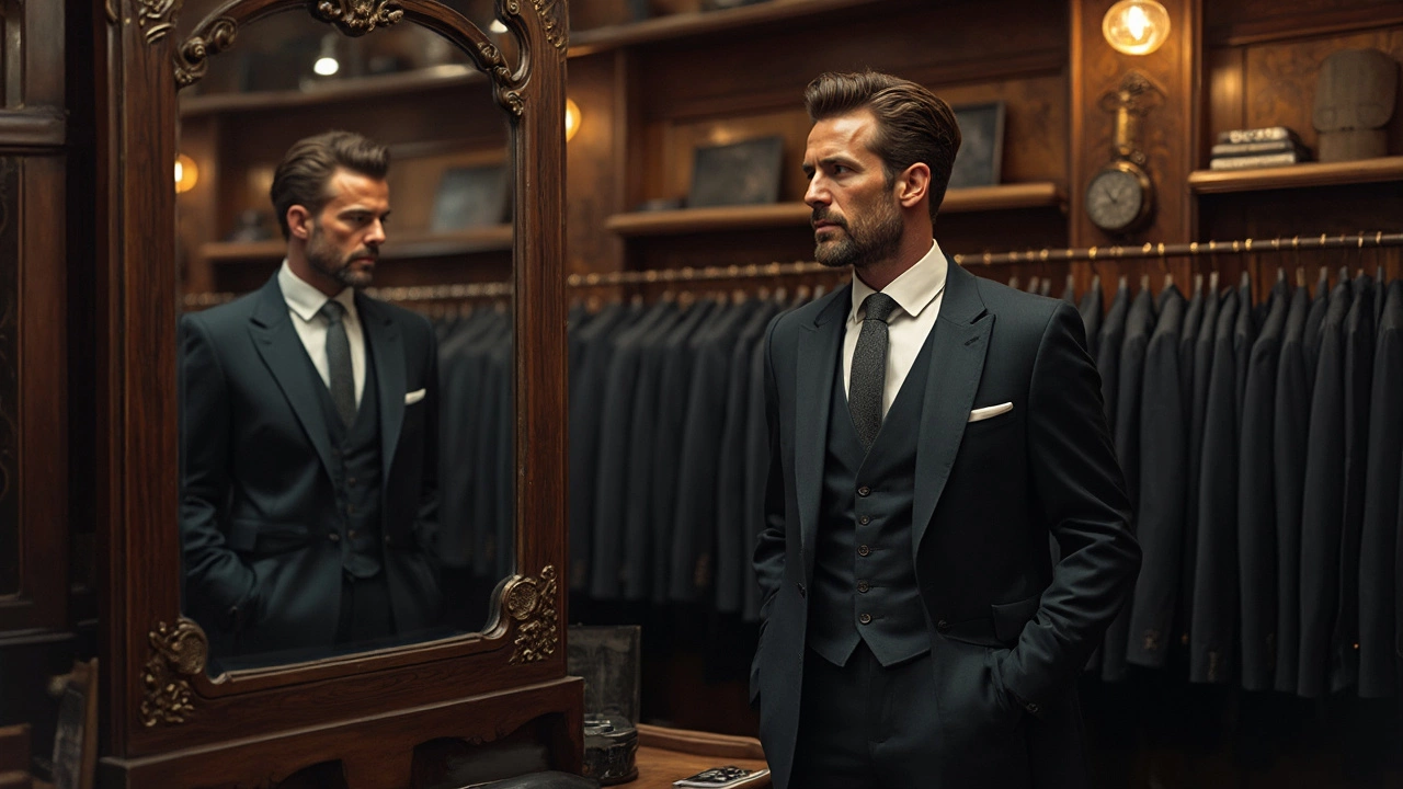
What Color Suit Makes You Look Skinnier?
When selecting a suit, color can significantly impact how slim and trim you appear. Dark colors like navy and charcoal not only give off a sleek vibe but also help hide any unwanted bulges. By learning how different hues affect perception, you can choose a suit that'll have you looking your best on the big day.
View More